PANTONE®
12-0312 TCX
Lime Cream
Digital reference #D8E7BC
Brand identity / Mobility & care
An identity for movement and care.
01 / The story
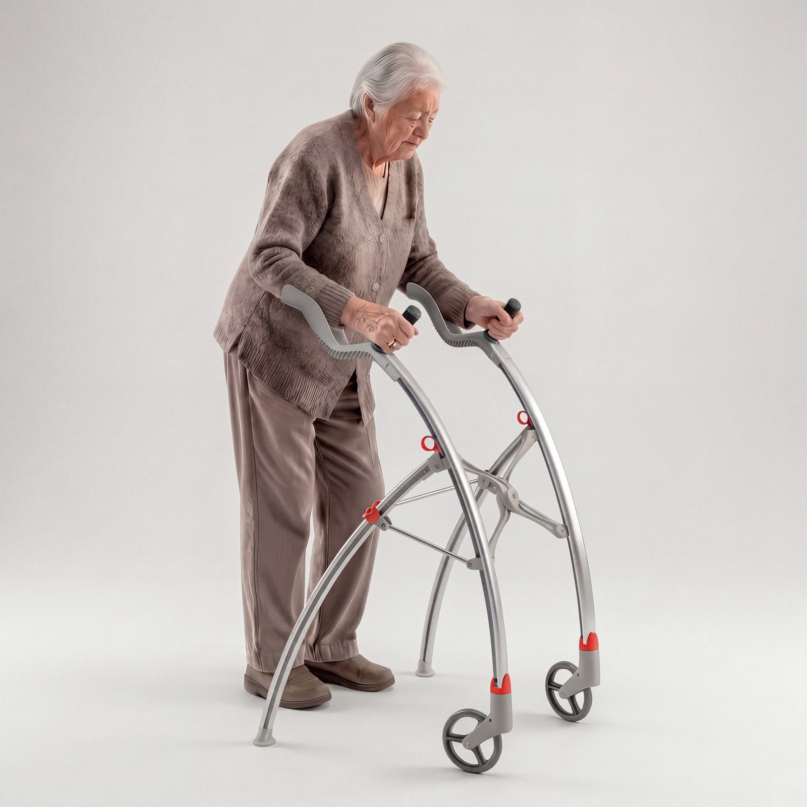
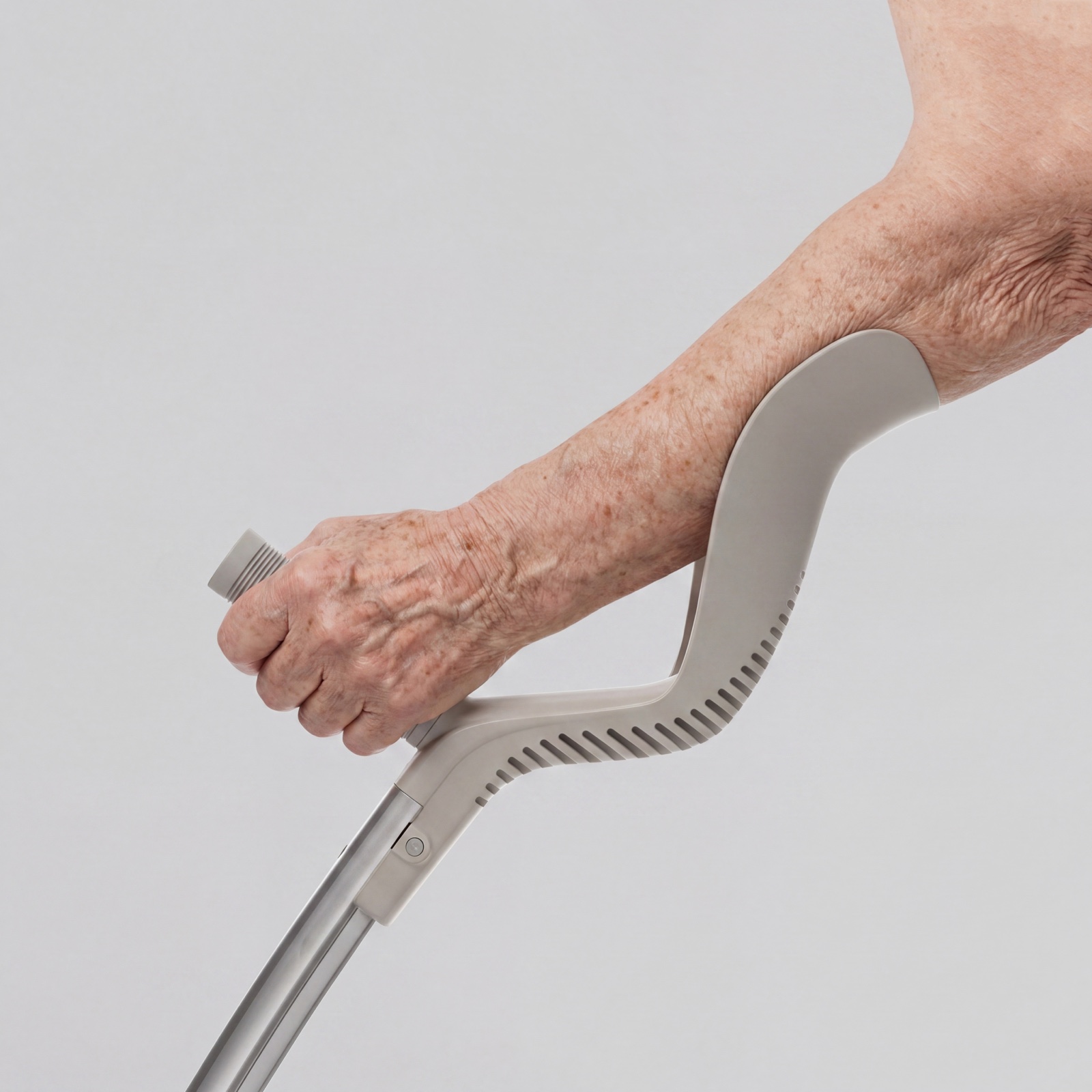
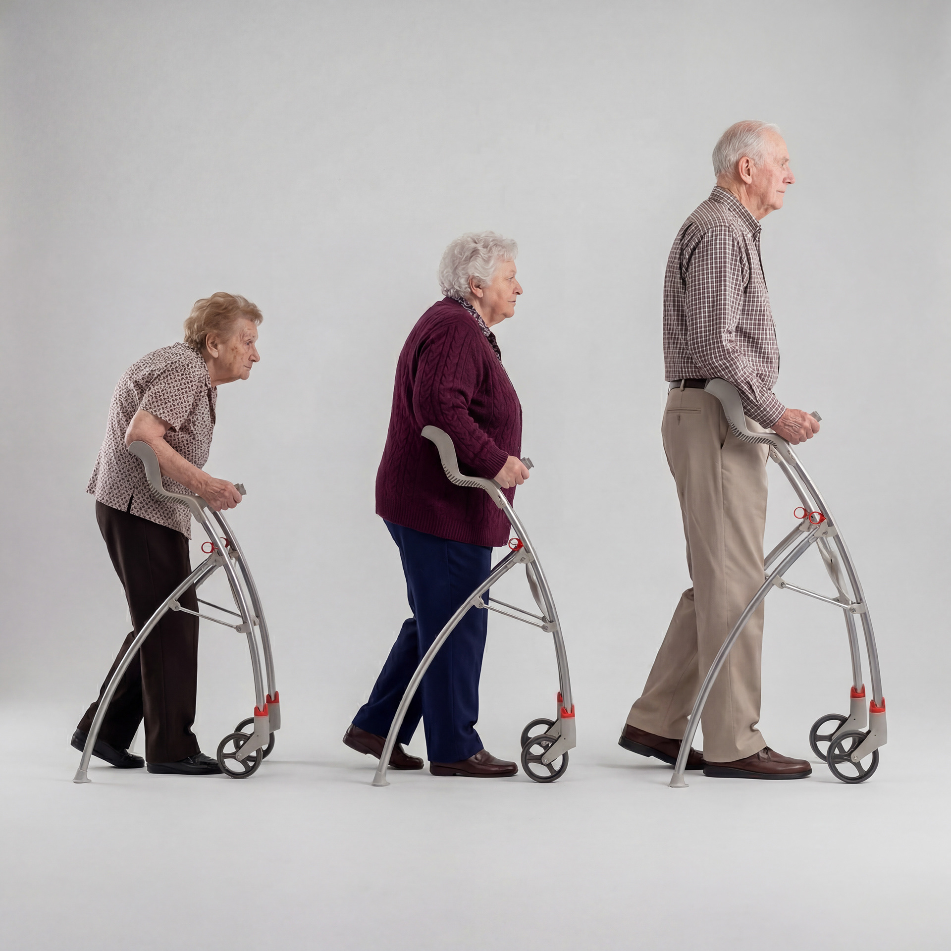
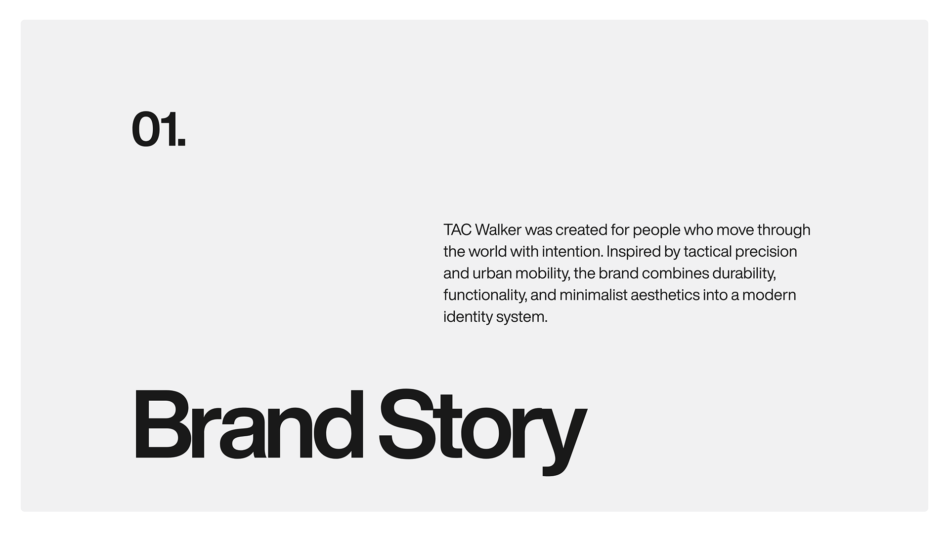
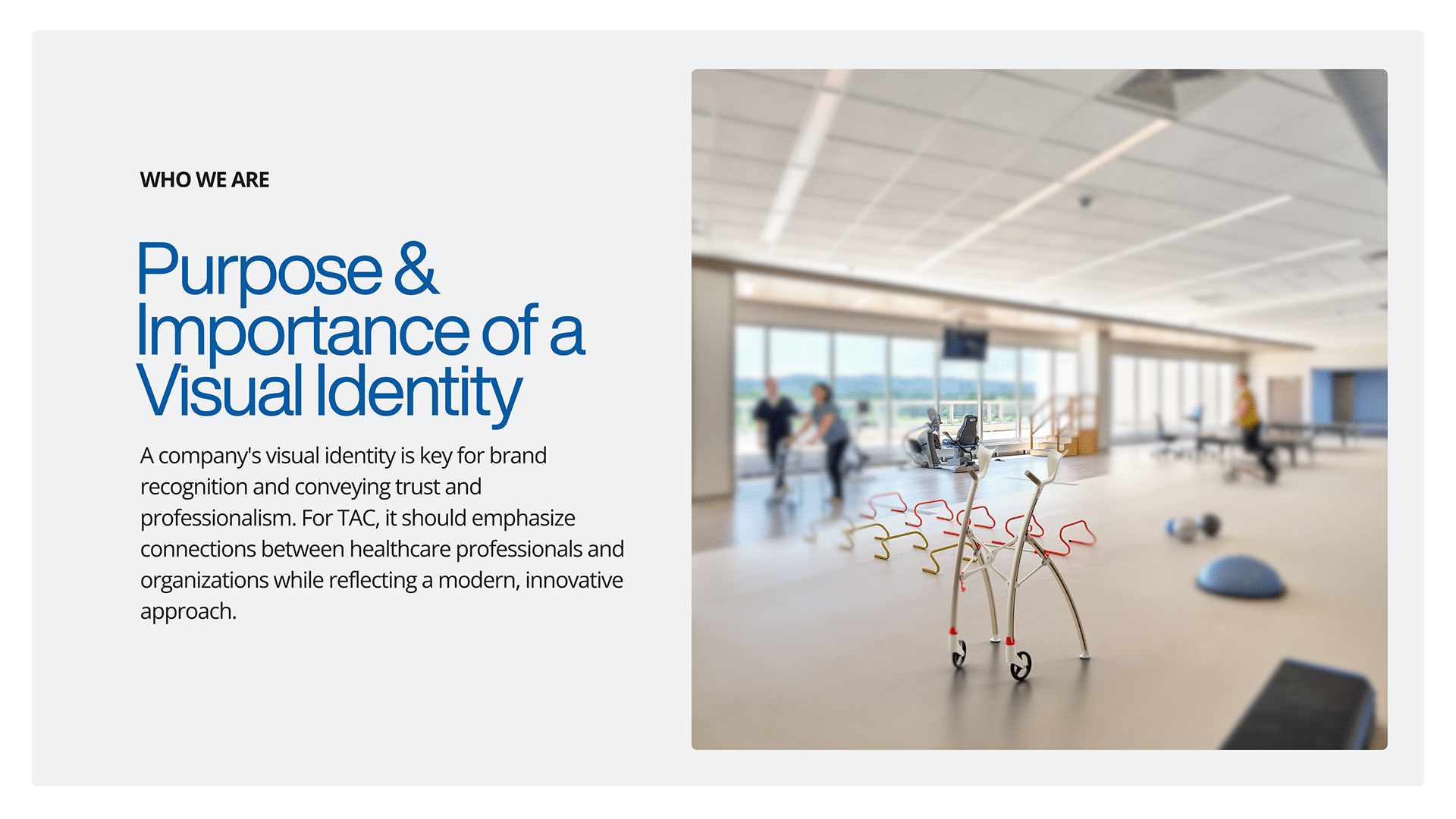
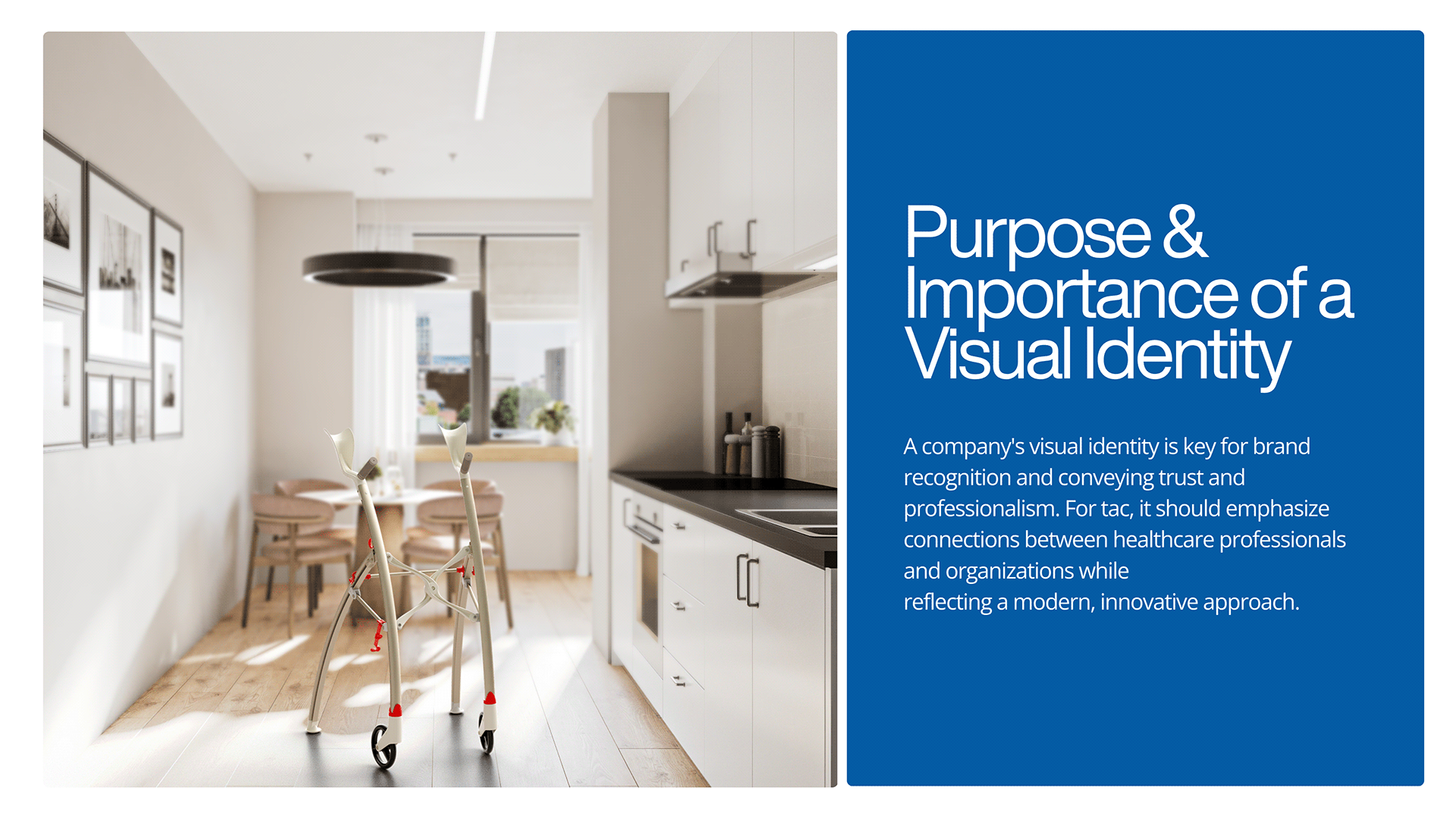
TAC — Third Age Comfort — brings purposeful movement, dignity, and care into a visual identity for mobility products.
The design direction connects professional trust with a modern, approachable character. The system brings the symbol, color, typography, and everyday applications together into a consistent brand language.

02 / The identity
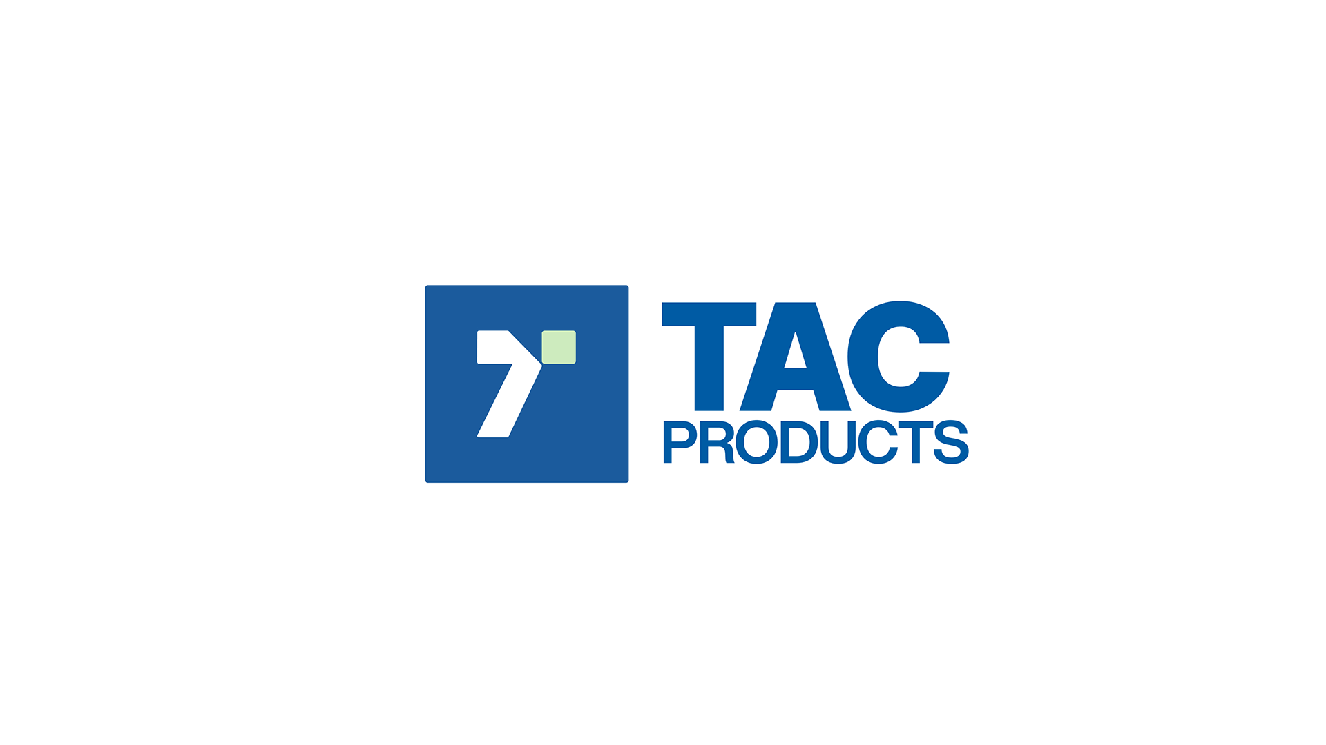
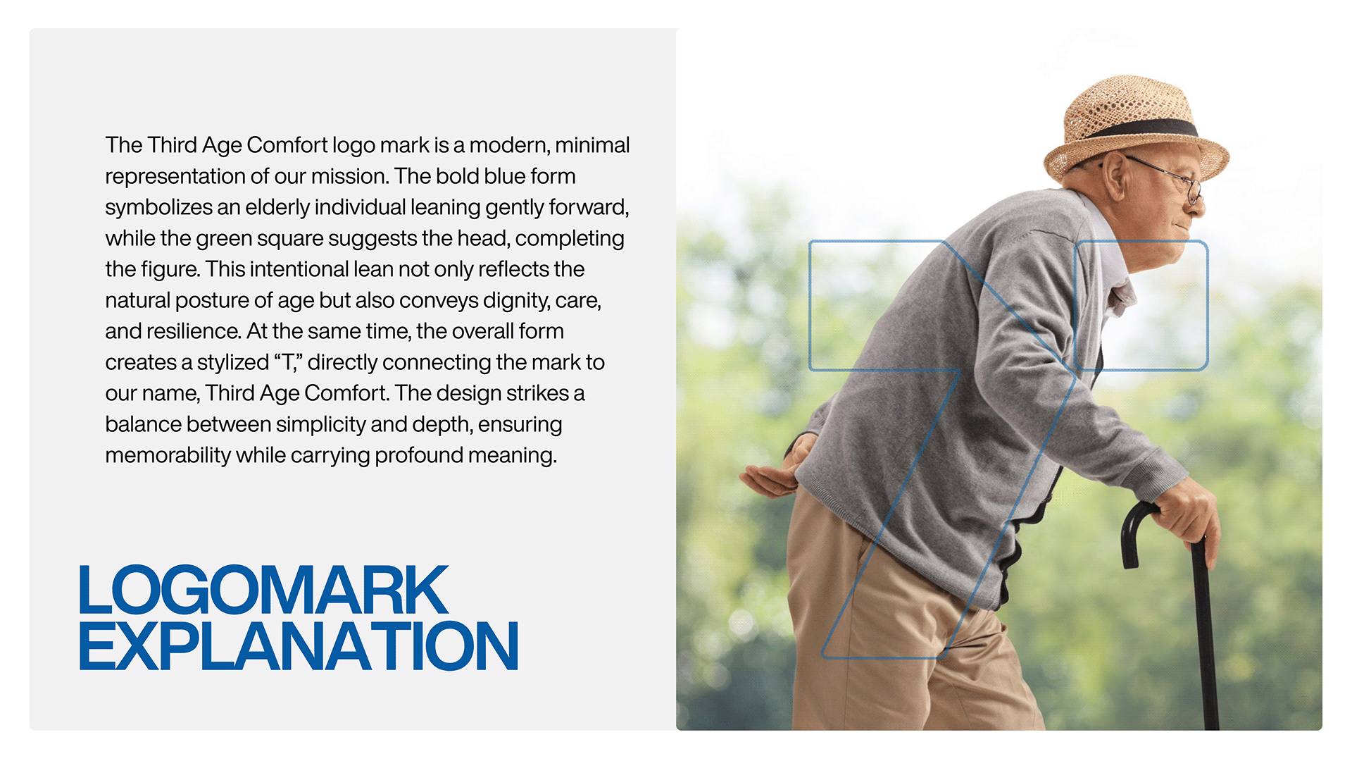
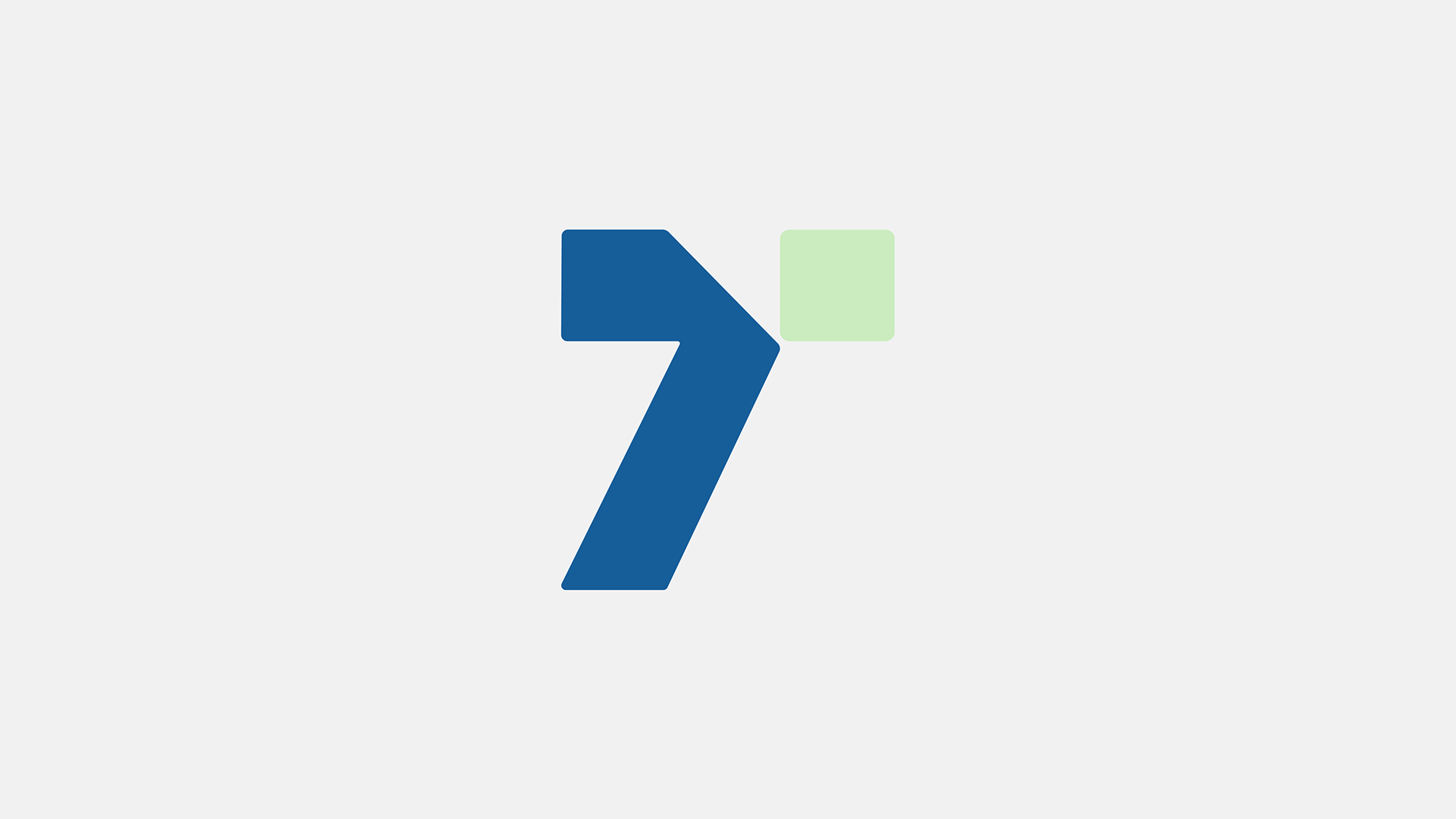
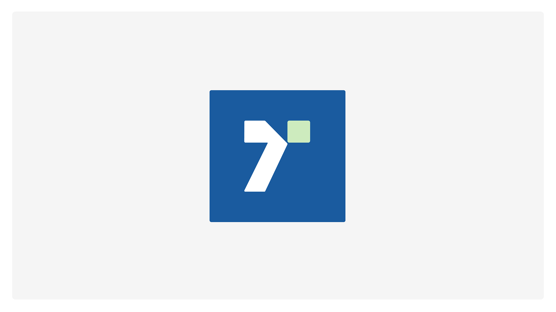
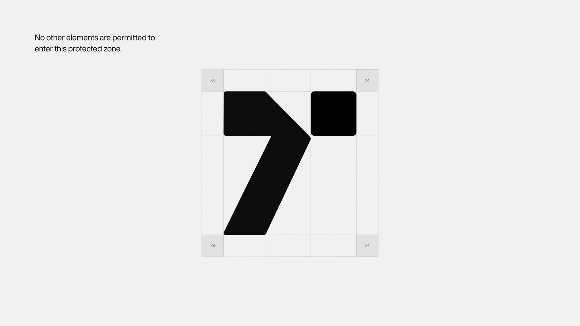
The blue form represents a person leaning forward, while the pale green square suggests the head. Together, they create a stylized “T” for Third Age Comfort.
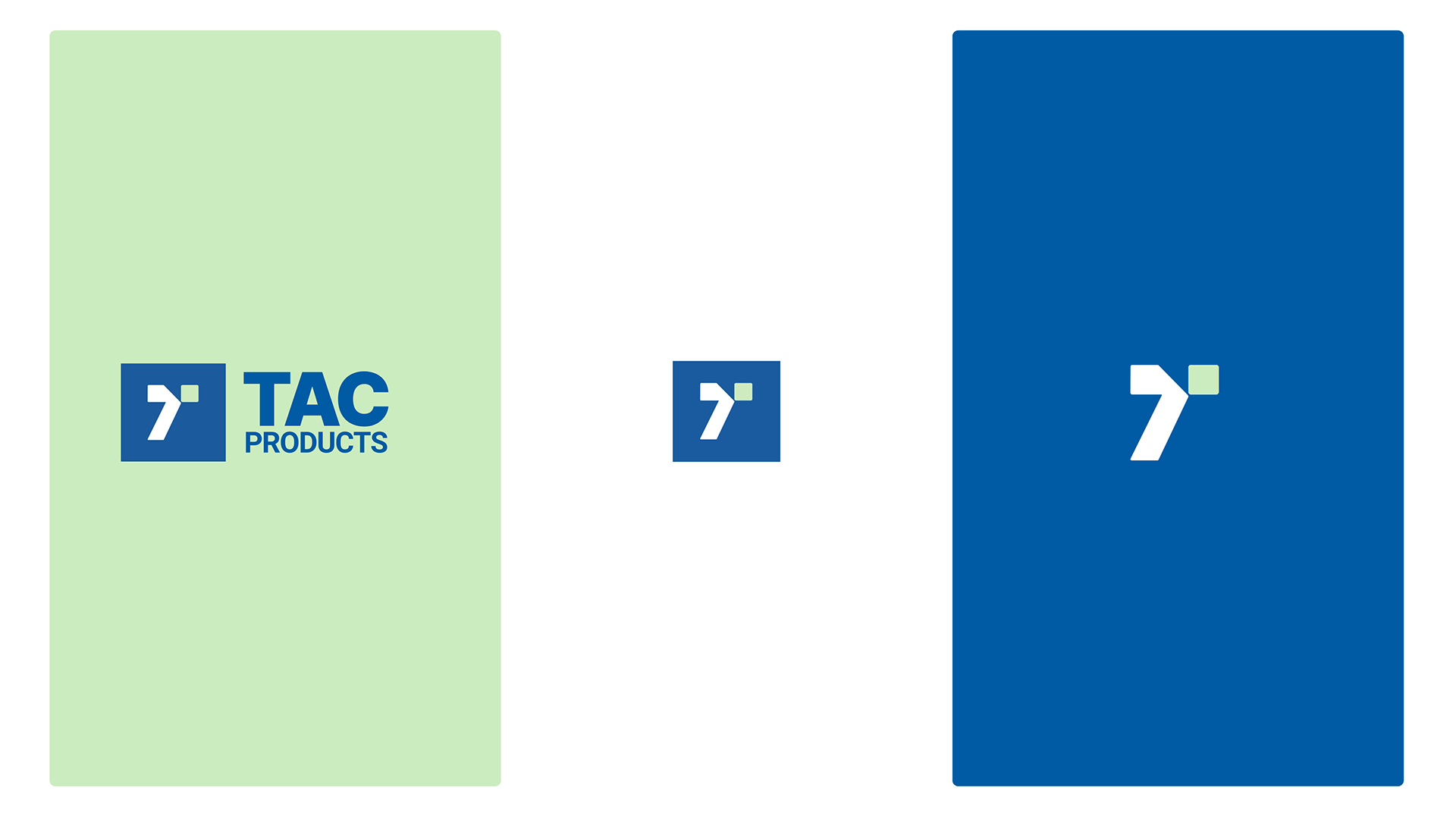
The mark connects the posture of movement with dignity, care, and resilience. Its compact geometry carries through the symbol, the full wordmark, and the wider identity.
03 / Color
Directoire Blue, Lime Cream, and Black Beauty form the core palette. Blue and pale green give the identity its signature contrast, with a dark neutral supporting the broader system.
PANTONE®
12-0312 TCX
Digital reference #D8E7BC
PANTONE®
18-4244 TCX
Digital reference #0261A3
PANTONE®
19-3911 TCX
Digital reference #28282A
04 / Typography
The brand guidelines pair Helvetica Now as the primary typeface with Open Sans as the secondary typeface. Both support a clear, contemporary approach to the brand’s communication materials.
Primary typeface
Precision in every step.
A clear, contemporary voice for brand headlines and core communication.
Secondary typeface
Thoughtful support.
A readable supporting typeface across the brand’s communication materials.
WalkerCOLLECTION
Precision in every step.A clear identity, from product to communication.
05 / Voice & applications
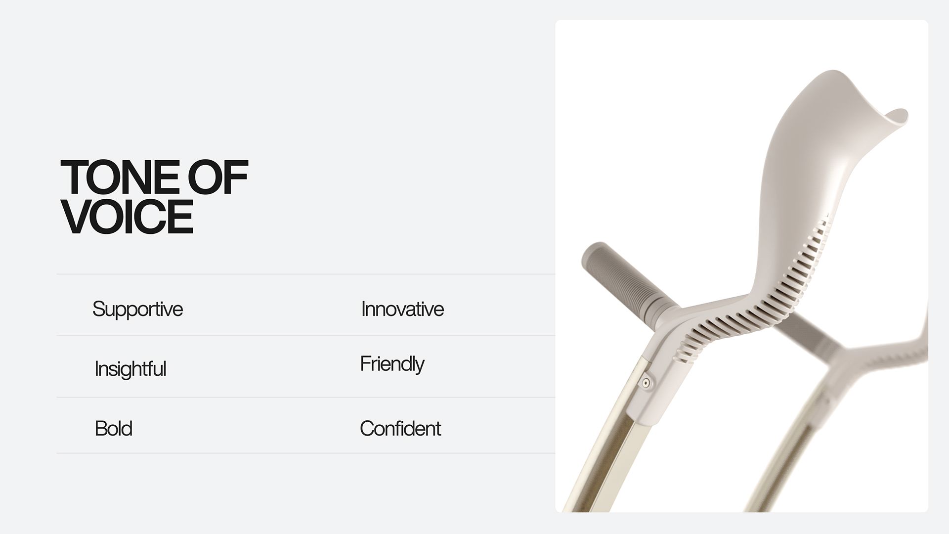
The identity extends from the product story to the words and materials around it. A supportive, insightful, and friendly tone sits alongside an innovative, bold, and confident character.
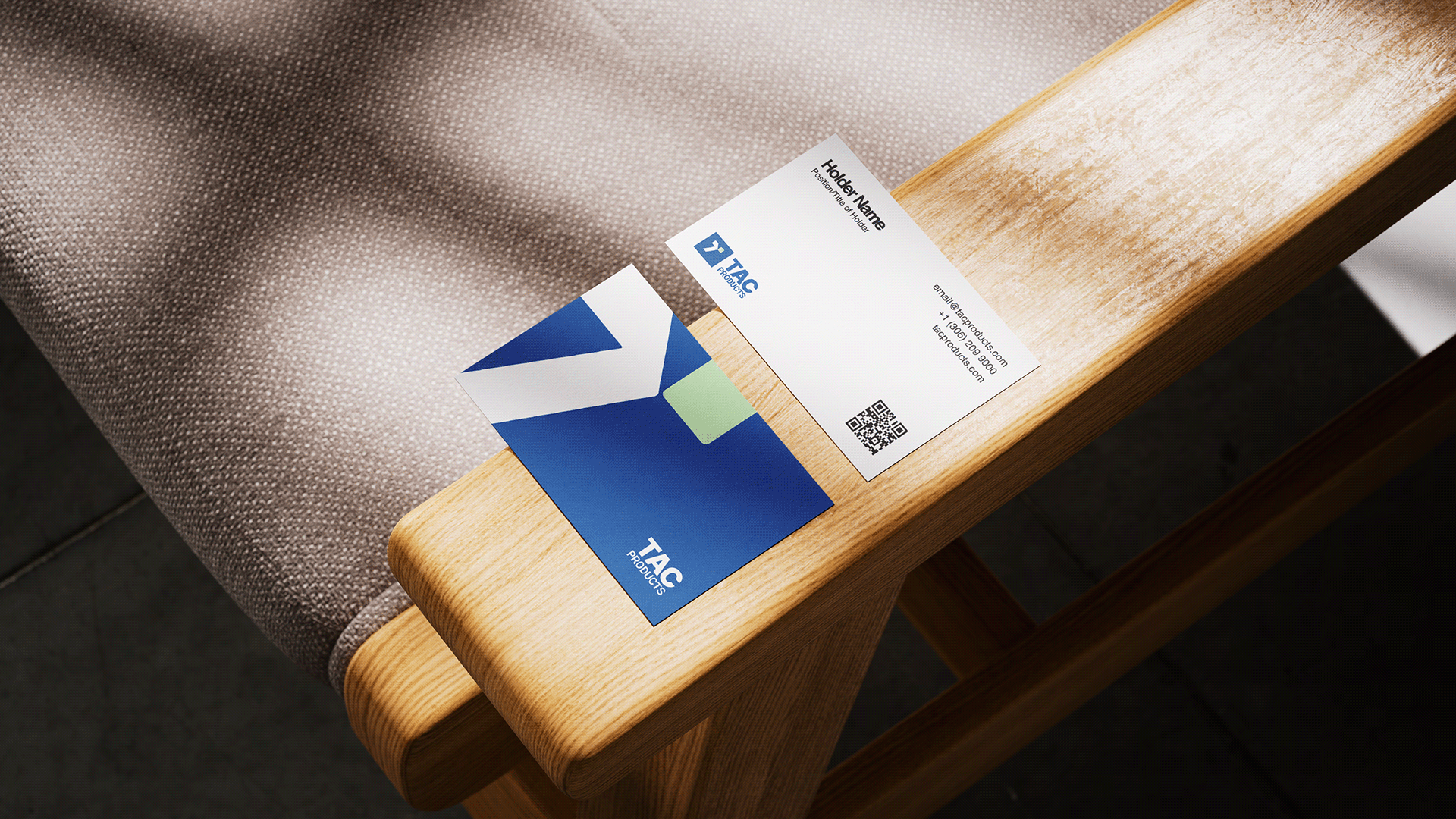
The business-card application carries the symbol, blue-and-green palette, and clear typography into a compact everyday format.
06 / The guidelines
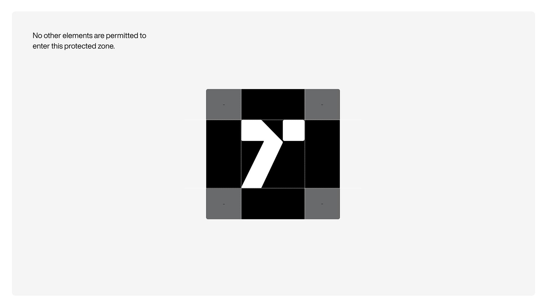
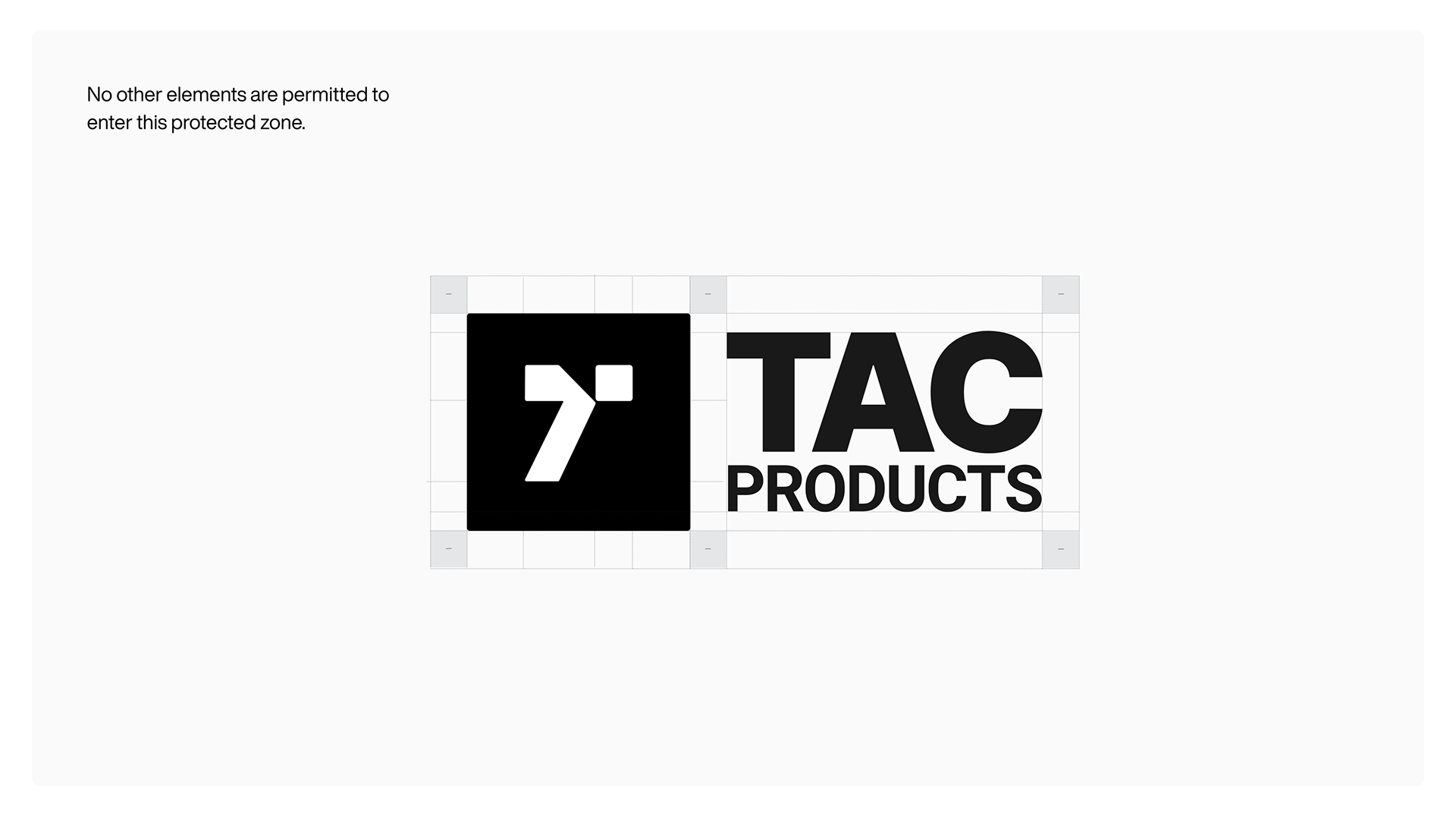
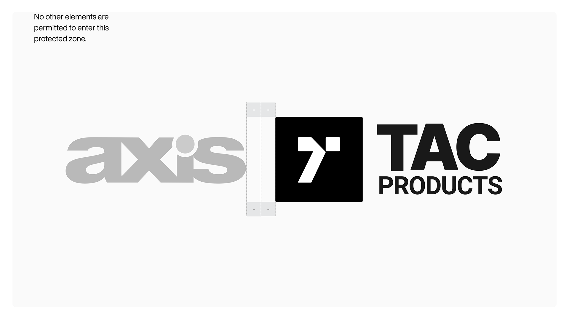
Construction grids and protected spacing give the mark room to remain clear. The supporting studies document how the symbol, full lockup, color, and type work across the identity.
Open the guideline group below to explore the complete set of studies.

Have a project in mind?